
Energy - data
/
Source: BP, chart by Vietecon.com
It’s Friday, and I don’t have a strong opinion about anything, although I have incipient/inchoate thoughts about all sorts of stuff. Those, however, take brain power, and I just don’t have that much right now.
I did find some interesting data that I wanted to share with you. Specifically, BP has a “Statistical Review of World Energy.” This is killer data. So without formal ado:
Chart 1 : Energy Trends

Source: BP, chart by Vietecon.com
Energy consumption: It’s up almost 9% annually in Vietnam since 1985! That’s 16.5x what it was back then. That’s economic growth in action. Prior to that (the data goes back to 1960), growth in consumption was only 3.7% a year. So Doi Moi really drove a lot of consumption.
Energy consumption per capita: Up only 7.4% per annum. Also since 1985. Prior to that, it was minimal: 1.2% growth. Aggregate consumption grows much faster than per capita, which may tell us that scale works for energy as well - adding an extra person doesn’t mean energy consumption goes up by the full amount that each person uses. Think of it this way: you don’t have to light a room double for two people. If it’s lit, it’s lit.
Electricity generation: Slower than energy consumption, probably because of motor vehicles, etc.
Source: BP, chart by Vietecon.com
CO2 emissions: This is not great. Up 8.1% annually since 1985. In comparison, the US is up less than 1% annually over the same period. Even China is only up 5.1% annually. In fact, Vietnam is the worst offender in terms of CO2 emissions growth in the whole world! Yet, it still represents just 0.7% of the share of CO2 emissions.
Chart 2: Energy sources
Electricity generation by source: We only have 2 years of data here, but it is not pretty. Coal makes up 41% of the mix. On the positive side, hydro (38%) and natural gas (21%) are big components here.
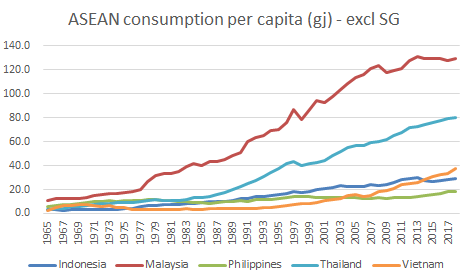
Chart 3: International comparisons
ASEAN consumption: Vietnam is still a low consumer of energy, even in comparison with its neighbors. [Note: I took Singapore out of here, because it just made the rest of the chart impossible to see - Singapore uses a lot more energy per capita compared to its neighbors.] Malaysia has the highest consumption by far, with Thailand coming in much lower. The rest are all grouped down below (although Vietnam uses almost 2x the amount per capita as the Philippines). At the bottom of the page, I added another chart that looks at all of the countries (minus a few small ones) for which we have data. Vietnam is way down in terms of consumption per capita.
Chart 4: International comparison - efficiency

Source: BP, World Bank, calculation and chart by vietecon.com
Let me explain how I do research. I find some data, like aggregate energy use, and I chart it. Turns out that there are some insightful things. But then I say: well, aggregate figures are all and good, but what is it on a per capita basis. Especially for Vietnam. Then I plot that out. Then I start to look at comparisons, and I think to myself: Vietnam looks good, but Malaysia looks so much higher, and so does Thailand. Well, maybe looking at per capita consumption isn’t the right thing. These countries are much richer than Vietnam. Let’s add in GDP as well. Then we can get how much GDP is produced by each tonne of oil equivalent [toe - this puts all energy sources together into one figure].
Dollars of GDP produced by one tonne of oil equivalent: What does it tell us? Well, the idea behind this is that it takes energy to produce pretty much anything. But energy also costs moolah, so the more goods/services you can produce with less energy, the better. Efficiency is the name of the game here. So this chart looks at how much energy is used to make the country go. Some countries are better at it (read: more efficient) than others. So on this measure, the Philippines actually look pretty good, so does Indonesia. Singapore looks bad, while Vietnam is also not that efficient.
So I would take this away. Vietnam uses little energy per capita, but it isn’t all that efficient and it has quickly rising CO2 emissions, which are also negative. It’s still really small compared to the rest of the world, but still Vietnam needs to get it together! Use energy more efficiency and make that energy with fewer emissions.
I have more charts to look at on Monday, but I am running out of time. So enjoy these. Talk later.
*Note: MTOE = million tons of oil equivalents, GJ = gigajoules, TWh = terawatt hours, M = million

Source: BP, chart by vietecon.com